The monthly report says people are visiting your website. Google Ads is sending clicks, social posts are doing their part and search traffic is slowly improving. Yet the inbox remains quiet.
It is tempting to blame the campaign, but traffic is only the arrival. What happens after someone lands on the website determines whether that visit becomes an enquiry or another forgotten tab.
A conversion-focused website does not need to pressure every visitor into buying immediately. It does need to make the next step obvious, worthwhile and easy.
The Message Takes Too Long to Understand
A visitor should be able to answer three questions within a few seconds: What does this business offer? Is it relevant to me? What should I do next?
Many homepages make people work for those answers. They open with broad claims about quality, innovation or excellent service, then expect the visitor to explore several pages before finding anything specific.
Clear copy is more useful than clever copy. State the problem you solve, who you solve it for and what the customer can expect. Supporting detail can follow once the visitor knows they are in the right place.
The Call to Action Is Easy to Ignore
“Contact us” is not always enough. It tells a visitor where to go, but gives little reason to go there now.
A stronger call to action connects the next step to something the visitor wants. “Request a quote”, “Book a consultation” or “Discuss your project” sets a clearer expectation. The wording should match the service and the stage of the buying decision.
Placement matters too. A single button at the bottom of a long page is easy to miss. Calls to action should appear at sensible points, particularly after the website has explained a benefit, answered an objection or shown proof.
Visitors Do Not Yet Trust the Business
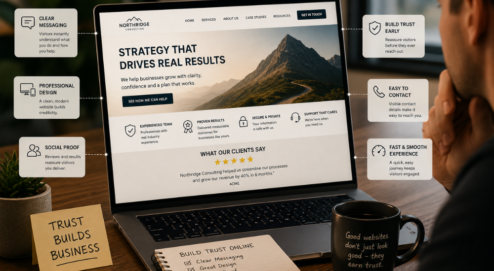
People rarely enquire because of a headline alone. They look for signs that the business is legitimate, capable and familiar with their type of problem.
Testimonials help, but only when they sound real. A first name beside a vague compliment carries less weight than a specific comment about the service and outcome. Case studies, recognisable client names, recent work, team information and clear contact details can all reduce uncertainty.
Trust is also shaped by small details. Broken links, outdated information, blurry images and inconsistent branding create doubt even when the actual service is excellent.
The Contact Process Feels Like Work
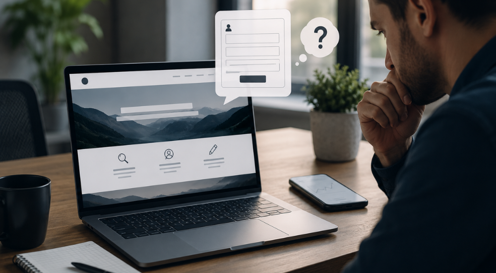
Every unnecessary field gives someone another chance to leave. A form asking for information the sales team does not need for the first conversation may be costing the business leads.
Ask only for enough detail to respond properly. Name, contact information and a short description of the requirement are often a sensible starting point. More complex enquiries may justify additional questions, but the form should never feel like an application for a home loan.
Mobile usability is equally important. Buttons need to be easy to tap, forms should fit the screen and telephone numbers should be clickable. Test the process on an actual phone rather than assuming a desktop preview is good enough.
The Page Does Not Match the Click
A visitor who clicks an advert for a particular service expects to land on a page about that service. Sending every campaign to the homepage forces people to search for the promise that attracted them.
Dedicated landing pages create a more direct path. The headline can reflect the advert, the content can answer relevant questions and the call to action can focus on one outcome. This consistency usually makes the experience feel more trustworthy and less confusing.
Traffic Is Not the Finish Line
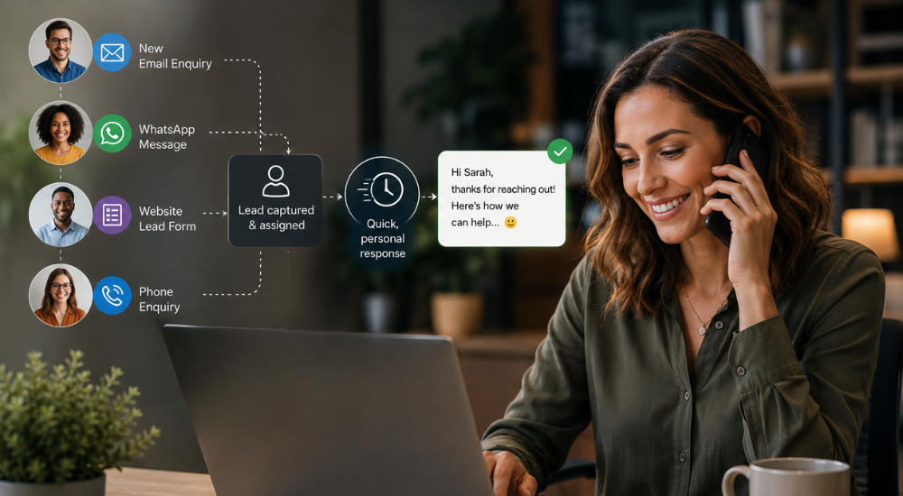
Generating more website enquiries requires looking beyond visitor numbers. Track which pages people enter, where they leave and which calls to action they use. Form submissions matter, but telephone calls, WhatsApp conversations and booked consultations may be just as valuable.
iHeartMedia builds conversion-focused websites and campaigns around a clear business goal: turning attention into genuine leads. That means examining the message, page structure, user journey and enquiry process together rather than treating the website as an online brochure.
Before spending more money on traffic, follow the path a potential customer is expected to take. If the reason to enquire is unclear or the process creates friction, fix that first. More visitors cannot repair a journey that gives them no convincing reason to continue.